Make your first fold sticky
How do you communicate "product" on a website? How do you win the battle between product positioning, introduction, description and opportunity in the first fold when every eyeball has the attention span of a kitten in a laser pointer factory?
It is the central preoccupation of every builder, every founder. If you want to derail their attention, have them visit their own website. The next few hours will be totally consumed via rewording, reorganizing, rebuilding.
It's no wonder, really. It is a lot to ask of a small piece of real estate. The painful truth is that "homepage/first fold" is often the only piece of content most people will ever see of you, so you have to get it right.
The first fold
The first fold is that section of your homepage that loads in the browser, before any scrolling is done. Obviously this is highly variable, especially when you consider mobile (which you absolutely should) but generally speaking, what you see on your computer when you visit can function as your working reference. If you want to be more precise, use Google Lighthouse to pull your web page and see what it considers as first fold (it will render images for you).
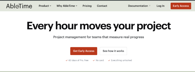
How important is it? Statistically, more than half of your site visitors will spend under 15 seconds on your website. Of that, the majority of that time will be in the first fold, with a few more spent on the second. So ... yes. Pretty darn important.
Who am I
"What you are" comes first of course, and spoken plainly. This is your "lede" story/introduction, and might be the visitor's very first impression of your organization. Throw prosaic nonsense up there like "your life, but automated" and you'll be out of their lives faster than a cracked mug.
Ah, but not so fast! What exactly is "what you are"? It is many things at once. It is your industry and product category. It is your differential, that thing that separates you from the competitors. It is the product you offer, how you offer it, and how much you offer it for.
This is one aspect that people often skip over: it is who you are for. Woe to the upstart who dives into the Enterprise without understanding SSO, ISO, SOC and all the other expensive acronyms.
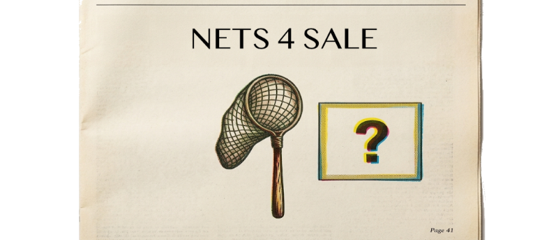
Just as important: if you don't service Group X, don't invite them to the party. If Group X discovers your product is really specific to Group Y, but only after they have spent countless hours configuring and migrating and training, they will quickly proceed to G2 or Trustpilot and voice all their frustrations so all the other Group X peeps won't make the same mistake. Don't sell your butterfly nets to fishermen, even if they both use nets, because the product likely isn't strong enough to land a trout.
So what?
Answering so what is also crucial. You are different. So what? That first fold better answer it, instead of forcing your visitor to do the math. If you are selling nets, and I am in the market for a net, why is your net any better than everybody else's? What makes your net stand out, and then why do I care about that, and then why do I care about caring about that? Finding the best "so what" for your homepage lede is pretty darn important.
Feeling the pressure yet? We haven't even started.
Product Positioning
Product positioning is the art of selling your differential, the thing that separates you from your competitors. "Our nets are triple-stitched and made of Kevlar polymers" is certainly a description, but it says nothing about why this is significant or important. I'm pretty sure butterflies don't need Kevlar polymers, so who is this for, and what problem does it solve? Am I, the potential customer, meant to figure this out on my own?
You have to be somewhat selective. You might have improved the pole, the hoop, or added a lanyard and GPS via Bluetooth. In a pitch you have to be very narrow, pick the best lede per audience and lean in on that, keeping the rest as backfill.
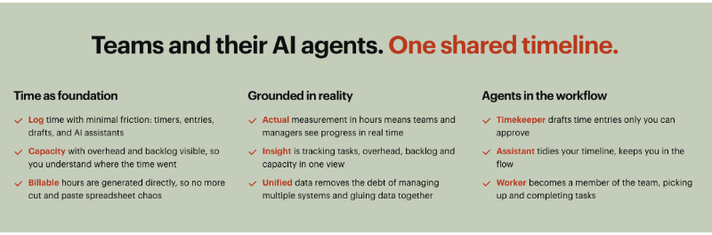
Use layout and styling to progressively highlight the most important messages. If visitors only gain one insight about your product from a section, what do you want it to be?
When delivering your product position on a webpage, you can be a little bit broader than you would one-on-one, but turn all of your product into meaningful, described benefit. "Our fully reinforced net can withstand the roughest treatment" is a much better delivery than lists of specs.
Cognitive frameworks
Next up is how you communicate all of this quickly and succinctly and memorably!
Use a schema. This is a contextual story or example that people can easily recognize or understand. When done correctly, the person carries away both the wrapper (the story) and the content (your product) in a related memory. Remember the butterfly nets example, and the lesson it served? That's schema.
There is an art to it. I can recall a commercial where a guy painted an end zone "chefs" instead of "chiefs"; it was an effort of long sweaty hours, but he never noticed until the very end. It was told well and quite amusing, but I have no memory of what the product was.
Good schema is often tied directly to the object it is describing. If you sell cars, make your schema about racing, or breakdowns, or long family trips, whatever fits your intent best.
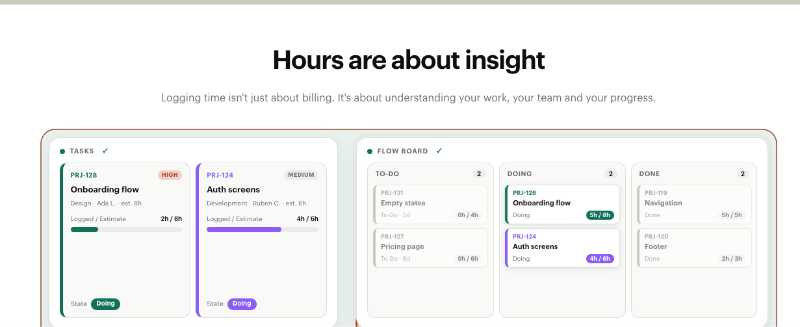
If not a story, then something that demonstrates. A video, an interactive demonstration, a diagram that explains in simple terms who you are, what you do, what makes you different.
Schema is a framework within which your product story and differentials will thrive.
KIS ...er, S
Keep it Simple (sorry, no offense meant ;) Stupid. Don't Make Me Think by Steve Krug is a 25-year-old book that should be on every builder's shelf. It is all about the tax of "next step" you put upon the visitor to your site. If the next step isn't clear, they are most likely to close the tab and move on with their life. Overwhelmingly so. You are fighting for that small sliver of people who are just interested enough to keep reading, but if you abandon them now, they are lost forever.
Simple navigation, clean uncrowded content, obvious next steps.
R.S.V.P.
One of the most important aspects of your homepage first fold is that it contains an invitation. To sign up, ask for more information, buy a net, set up a demonstration, or do whatever it is you would like that visitor to do next after visiting your website.
A Call to Action, or CTA, is the thing. A Call to Action is a piece of content on your homepage, first fold, that calls upon the visitor to take that desired first action. Make it overt, but not obnoxious. Everything that surrounds the CTA is the why; the CTA is the how. If you have convinced the visitor a little, maybe they'll poke around the site a bit more. If they are convinced a lot, they may click through straight away.
The point is, don't hide your invitation.
The journey
Visitors will mostly leave your site never having scrolled even a fraction, so your first fold better be compelling. Those who remain will overwhelmingly never visit more than the homepage, so it better be complete. Those who dive deeper, or even better click on your almighty CTA, those are the ones you convinced.
Two great books on the subject are Obviously Awesome! by April Dunford, and Made to Stick by the Heath brothers. Both are filled with great lessons that are applicable across many aspects of how you present and represent your organization.
I suggest reading them both before you revisit your website ... otherwise you're probably going to want to rewrite it all again!
— Grant Shepert is the founder of AbleTime; life currently finds him coding, writing, and occasionally renovating in the north of France.